They should really be called graphic artists
I live on a tiny island where 95% of the people I meet are medical students. So when I met a graphic designer who was visiting the island a few weeks ago, I was ecstatic!

“Can I come over tomorrow?”
“Can I see your portfolio?”
“Can I buy you coffee?”
“Can we be best friends?”
The next day I brought my computer over to her apartment, ready to “talk shop” with my new friend. She pulled up her portfolio and my heart sunk. Her first project was a few clothing images copied and pasted together to form a marketing email. I tried to stay positive…
“how did you come up with that design? What made you choose that font and color scheme?”
“Oh I don’t know, I just thought it looked good.”
After an hour of trying to learn from her, I came to this conclusion: graphic design is boring.
I love design, but design has to be beautiful and functional. Design is full of purpose and meaning, not just aesthetics. If it doesn’t have a purpose or functionality, it’s art. And I don’t want to be an artist.
It’s art if can’t be explained. It’s fashion if no one asks for an explanation. It’s design if it doesn’t need explanation.
— Wouter Stokkel
T-Shirt Design
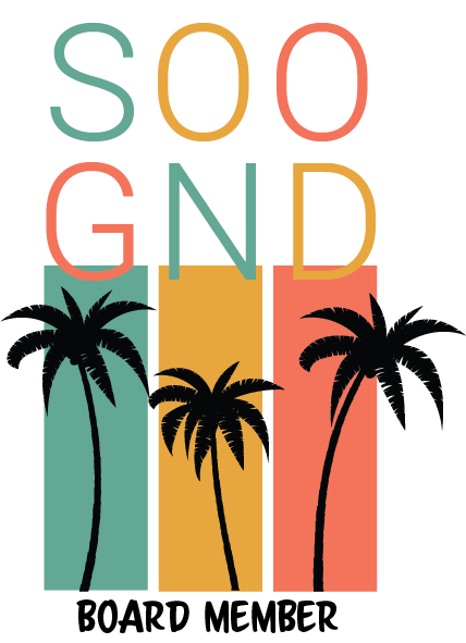
I was a board member for an organization called the SOO. We were running out of our old tank tops and I was asked to design a new shirt. I had never designed a shirt before, so I tried to apply design thinking. I could easily empathize that the users would be hot because Grenada is a hot climate. I knew that the SOO didn’t have much money and that the users would have to pay for these shirts themselves. I found a cheap tank top. I also knew that the users (mostly girls) wanted to look ‘cute’ in the shirts. I used fun, tropical colors to help the shirt “feel” Caribbean. I created a sorority-like design and showed it to my users. When the users were happy with the way it looked, I had them printed on tank tops. The whole process took a few hours. People loved the shirts. I received many requests to create another tank top to sell to non-board members. I declined.
SGU Go
SGU Go is an IOS app that solves many problems with the St. George’s University (SGU) bus system. When I created SGU Go, I wanted to use colors and a fonts that were full of energy and fun. People are often hot, frustrated and tired when using the bus system. So I wanted the app to be lighthearted and friendly. I also needed to create a strong tie to the school that I was designing for. Without the school logo and colors, the users may not even realize that it’s an app for them. The school’s branding is very collegiate and professional. This was the exact opposite of my vision for SGU Go’s brand. So I iterated until I found a design that matched the university. In the end, I designed a collegiate app, with fun, energetic text that expresses the branding and tone.
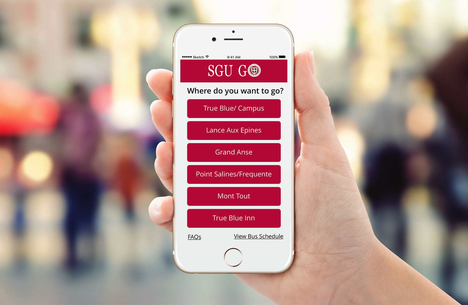
This made my app less “beautiful”, but more user friendly. It doesn’t matter how beautiful an app is if no one uses it. This constraint allowed me to think creatively which led me to learn about the power of UX writing.
Unleash the Power of UX Writing
There are so many different tools and areas of UX design that can help you design your app in a user-centered way. Content Management, Branding, UI, UX Writing, UX Color, Graphic Design and so many more. In this project, I used UX Writing to help me overcome my branding issue. I found this article that taught me the power of clear, concise, useful words and branding tone.
Since I’m a good product designer, when I start writing copy for my app, I had already learned to empathize with my user. The user is generally hot(it’s always hot in the Caribbean), tired, and waiting for a bus that may or may not come. The user needs positivity, clear communication and useful options.
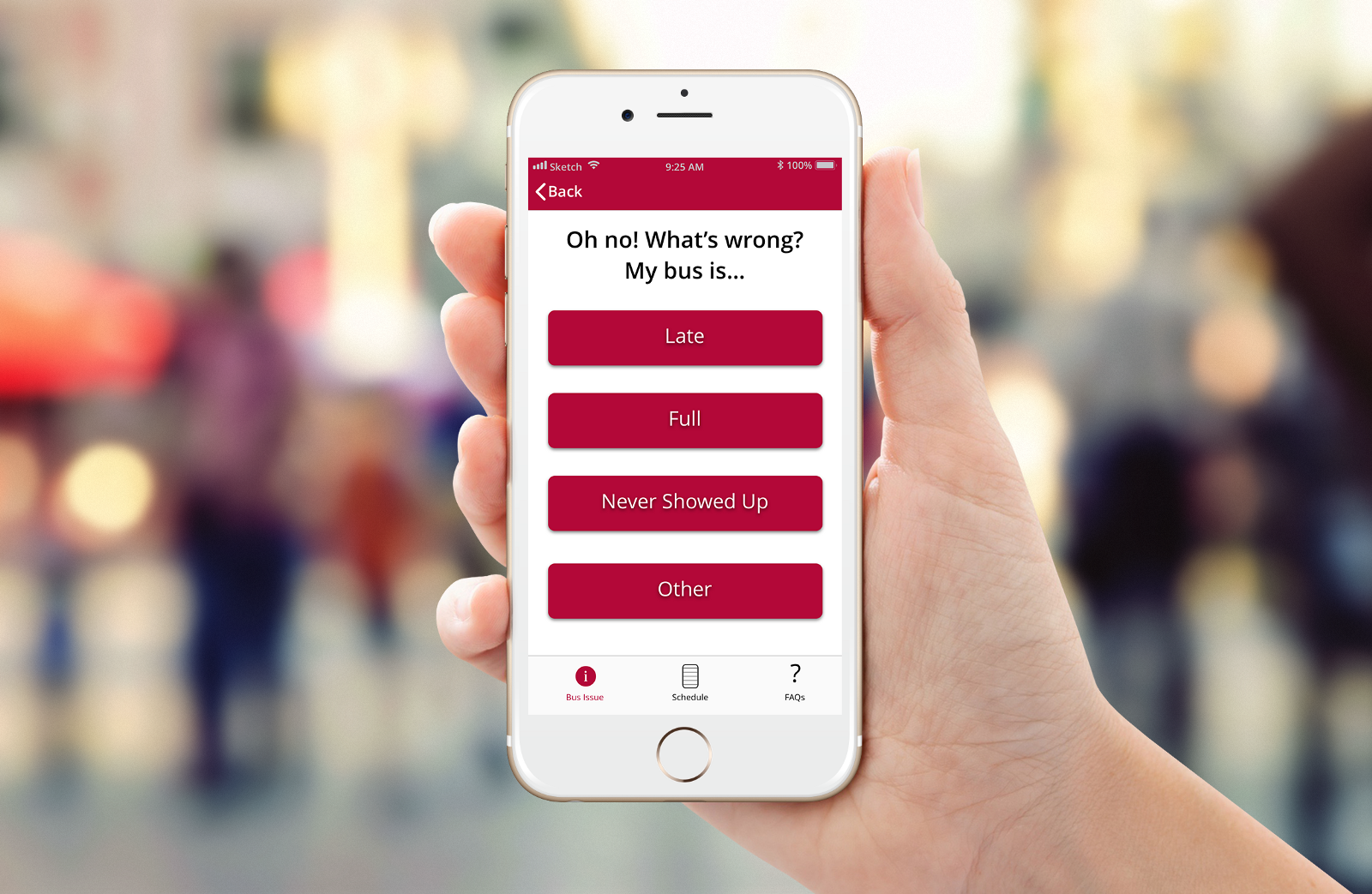
Instead of a screen full of buttons, I included a short phrase.
“Oh no! What’s wrong?”
This phrase conveys concern, care and utilizes conversational language. When your mobile app doesn’t have much text, the text you do have is very important. When you can design every word to empathize with your user, the text transforms into UX writing.
“Oh no! What’s wrong?”
This conversational language adds a human touch to the frustrating circumstance. It sounds identical to a message you would receive from a friend. It is organic and natural. If the app read:
“Please select the bus issue that occurred below.”
the same point is made, but the experience with the app is drastically different. It looses it’s friendliness. It feels like a machine, not a conversation with a friend.
“My bus is…”
The answer to “Oh no! What’s wrong?” usually starts with “my bus is…” and ends with one of the three first buttons. Conversational language is a great resource for making your app feel intuitive.
Purpose Creates Passion
I loved the challenge of designing SGU Go. I can point to any part of screen and explain the planning, thought, and research behind its design. I love the tools that can be used to continually iterate it to make it better and better.
I don’t love my SOO tank design. I don’t hate it, I’m just not passionate about it. I could try to iterate it, but it wouldn’t be better. It would just be a different design. It doesn’t solve a problem. It doesn’t change my life; it doesn’t change your life. It’s boring. I believe that graphic design is a great tool to improve your products. But alone on a T-shirt, it isn’t design, it’s art.